App Update
Progress
It's been a long time without an update. We've continued work on the App in the stolen hours after our regular jobs where we're still mentally able to put in the effort required to tackle some of the harder problems. Weekly scheduled work sessions have been a good way to keep slow and steady progress in the months where our careers are too taxing. Since last update we have made a lot of progress; an entire rework of the coding architecture of the app, an entire rework of the card frames, and other small improvements. We still have a couple big hurdles left to clear, like implementing the AI logic, but I think we're at a place where all of the loose ends to finish the App have become clear.
New Card frames
I'm particularly excited about these because one of my goals as a game designer is always to make things as easy on the player as possible. Visual clutter is a huge problem in a lot of games, and contributes immensely to overall perception of a game at every level of player. From how enticing the game looks to a potential new player, how difficult it is to both pick up playing the game as a new player, and how easy it is to assess the board as an experienced player. Excess symbols, boxes, and text are always things that should be streamlined.
My favorite example of this in games is the use of color. Imagine a game of Uno where the cards had two symbols, a number and a letter, instead of a number and a color. In that game you would be able to play a card that matched either the letter or the number, instead of the color or the number. The game would be the exact same, but the mental strain to match things would go up. The use of color is a visual and mental shortcut that is easily used to reduce clutter. People are pretty good with colors, and as long as you don't go too crazy or use too similar of colors, it's an easy way to differentiate things.
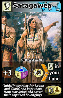
The other shortcut I want to touch on is symbols. You could write out "Card type: Person" or just "Person" on the top left of every Person card and it would work fine, but same information can be delivered in a less mentally taxing way by just using an easy symbol that everyone would register in their minds as a person (see card image below, the card type symbol in the top left). These are a little more dangerous since the more symbols you use in a game, the harder the initial play through will be for a player. They need to learn all or at least most of the symbols and what they mean before they can make educated decisions in the game.
In general, it is great to use symbols as long as there aren't too many and each symbol is utilized enough to justify the initial investment of having a player learn that symbol. It should go without saying, but I've seen it enough in big games that it's worth saying: symbol meanings should be immediately obvious. Magic Arena is a big offender of this, tons of symbols there don't look anything like how you'd expect, so just cause more confusion.
Everything else about a card's construction should be as minimal and sleek as possible to not deter from the main things: 1) What does it do? and 2) Make the picture the star. So here are some before and after of a few cards (the Wild resource also got a slight update 😊):
After


Before

After

Before

I decided it was time to get rid of the flags because even though I liked the extra flavor they added, it brought too much visual clutter and didn't affect gameplay. Removing the black box at the bottom was something I should have done a long time ago, as now the cards look much cleaner without extra segmenting boxes. I lost some flavor text room, but you can't argue with how sleek it looks now, and the beautiful art is the star of the card.
It took longer than I'd like to admit but it was definitely worth it. I find myself admiring certain cards from time to time. Paris is gorgeous.
Code Restructure
I won't get too much into the details as this was some great work done by Nick, but we were able to offload all of the functions from the cards themselves to the framework of the game, reducing the total number of functions running by a factor of maybe 20. This brings a massive performance boost and in general is a massive increase in elegance. It's interesting to me that things like this are probably more important than the rest of the visual stuff I talked about, but I can't really show anyone anything. Not being annoyed at poor system performance is about all anyone gets to notice, but the feel of it is something everyone would (maybe subconsciously only) notice.
...and some lessons
One of the things we sunk a lot of time into and eventually moved away from was trying to create dynamically generated cards. The most difficult part of this endeavor for me so far has been trying to get the displays looking good. The seven paragraphs above talking about card visuals is probably a tip off to the reader, but I think the visuals are arguably just as important as the gameplay in the experience. One of the things we planned on doing originally was making the cards procedurally so that they would be able to be disassembled easily if we wanted to place the individual parts spread differently across the screen and it also had the plus side of not requiring two large images per card (one for the background picture, another for the entire card with symbols on it).
In the end, the containers and Flexbox style ended up being far too massive of a chore than biting the bullet and having more images bloating the size of the app. Phones and tablets have far too many different aspect ratios to build the display in any other way than percent of screen.


Comments
Post a Comment